
- App Framework & App Banners
Original concepts:
- App Framework — Spatial Model, Cards, Auxilliary Panels, Navigational Model:
Figma design file - App Banners:
Figma design file
- App Framework — Spatial Model, Cards, Auxilliary Panels, Navigational Model:
-
Current concepts:
-
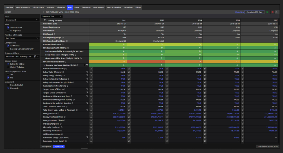
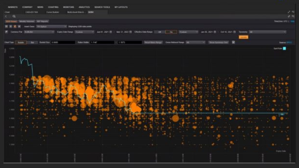
App Banners — ETP (Entity-Task-Parameter) Editing:
- Product Designer: Yooch Wan
- Figma design file > App Banner - Edit In-Place
-
Multi-Entity Banners:
- Product Designer: Yooch Wan
- Figma design file > Multi-Entity Banners & Aux. Panel
-
Auxilliary Panel (Framework-level side panel):
- Product Designer: Yooch Wan
- Figma design file > Multi-Entity Banners & Aux. Panel
-
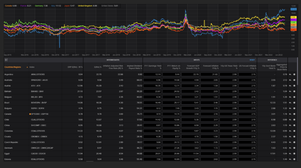
Compare / Peer Analysis:
- Product Designer: Yooch Wan
- Figma design file > Compare / Peer Analysis
-
-
Design Approach:
-
For each Design Sprint:
-
Katia B. (Product Owner), Giorgio V. (Product Design Director), Yooch Wan (Principal Product Designer), Prean P. (Principal User Researcher) reviewed hypotheses backlog and prioritised which hypotheses needed to be tested in a design sprint.
They may include ones which were carried over from the previous sprint if the outcome from testing in the previous sprint wasn't conclusive.
-
For each hypothesis:
- Not only designed the various potential solutions (emcompassing interaction Design, UI design and prototype creation), but also work with Product Owner to come up with example workflows for users to test against.
- Prean P. (Principal User Researcher) handled all research-related activities (recruitment of users / testers, testing session preparations).
-
-
-
Design Sprint 1 — Spring / Summer 2020
- Overall focus: Spatial Model
- Objective: Test the Spatial Model Framework which will cover three core elements; App Banners, Cards and an Auxiliary Panel. Gather feedback on how users interact with and navigate using these components.
- Product Designers: Giorgio V. & Mike A.
- Prototyper: Mike A.
- Design: Figma design file
- Prototype: Figma design file
- Research Documentation: Sharepoint
-
Design Sprint 2 — September 2020
- Overall focus: Further explorations of navigational concepts, findability of content and tools, as well as editing and changing the focus of content in view.
- Product Designer: Yooch Wan
- Prototyper: Balazs M.
- Researcher: Prean P.
-
Covering:
- Active Selection & Concept of a "Universe"
- App Banners
- Cards
- Auxilliary Panel (sidebar)
- Related Content
- Cards
- Hypotheses & Notes: Figma design file > DESIGN SPRINT 2 - Hypotheses & Notes
- Workflows for Prototyping: Figma design file > DS2 - Workflows for Prototyping
- Axure Prototype: Requires access to corporate network via VPN or VDI - MAY NO LONGER BE AVAILABLE
- Research Documentation: Sharepoint
-
Design Sprint 3 — October 2020
- Overall focus: Content Display and Navigational Customisation via Aux. Panel.
- Product Designer: Yooch Wan
- Prototyper: Yooch Wan.
- Researcher: Prean P.
- Hypotheses & Notes: Figma design file > DESIGN SPRINT 3 - Hypotheses & Notes
-
Prototypes:
-
Design 1:
- To test: Hypotheses 1, 2 & 3 — Global actions menu, most relevant content & tools
- Prototype: Figma design file > → DS3 - 01 - Design 1 - Hypotheses 1, 2 & 3 - Global Actions Menu, Most Relevant Content & Tools
-
Design 2:
- To test: Hypothesis 6 — Customised Overview pages, Aux. panel settings
- Prototype: Figma design file > → DS3 - 02 - Design 2 - Hypothesis 6 - Customised Overview Pages - Aux. Panel Settings
-
Design 3:
- To test: Hypothesis 6 — Customised Links to Content in Aux. Panel
- Prototype: Figma design file > → DS3 - 03 - Design 3 - Hypothesis 6 - Customised Links to Content in Aux. Panel
-
Design 4:
- To test: Hypothesis 4 — Research App, Entity focus & Filters
- Prototype: Figma design file > → DS3 - 06 - Design 4 - Hypothesis 4 - Research App - Entity Focus & Filters
-
Design 5:
- To test: Hypotheses 5 & 7 — Predefined page content based on user roles
- Prototype: Figma design file > → DS3 - 04 - Design 5 - Hypotheses 5 & 7 - Predefined Page Content based on Roles
-
Design 6:
- To test: Hypothesis 7 — Predefined page content based on user roles
- Prototype: Figma design file > → DS3 - 05 - Design 6 - Hypothesis 7 - Predefined Page Content based on Roles
-
Prototype selector for user testing sessions:
- Design: Figma design file
- Prototype: Figma design file
-
- Research Documentation: Sharepoint
-
Key Outcomes so far:
- Cards are a way for users to navigate
- No clear difference for users in determining the separation between "Content" (the navigational links within aux. panel) and "Tools" section, although one user clearly understood the design intent and saw value. Most users found it difficult to distinguish as some apps offering "content" are also "tools".
- Traders — Minimise clicks! (menus) etc.
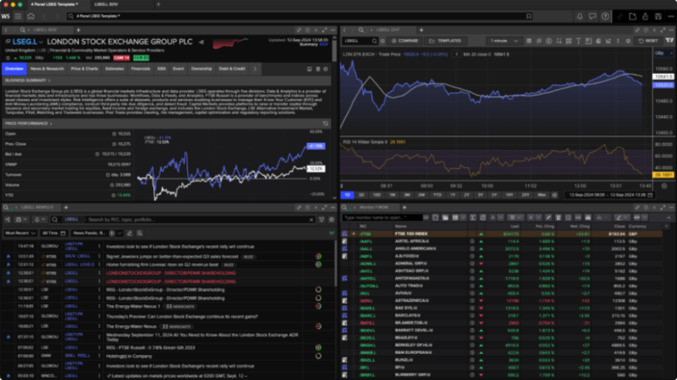
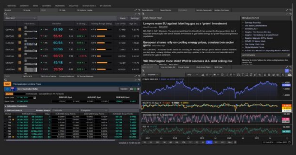
Single-Entity & Multi-Entity App Banners & Auxilliary Panel
- Product Designer: Yooch Wan
- Previous Product Designers: Mike A. & Giorgio V.
- Researcher: Prean P.
- Visual Designer: Chris B.
-
General info — on Sharepoint:
- App Framework Team - Sharepoint Area: Redacted
- Workspace Conceptual Model: Redacted
- Navigation: Redacted
- Desk Research on Navigation: Redacted
- Setting the Universe & Signposting: Redacted
-
Visual Designs (Banners & Aux. Panel):
- Visual Designer: Chris B.
- Designs: Figma design file
-
Multi-Entity App Banner Designs — for initial development — 07-Oct-2020
- Agreed by Katia B. (Product Owner) and Christiana A. (Business Analyst)
- Staged approach — classified as a POC (Proof-of-concept)
- Designs: Figma design file > Multi- Entity App Banners & Aux. Panel > see top-left of canvas (agreed design for development - Oct 2020)
Responsive Behaviour & Responsive Breakpoints
- Product Designer: Yooch Wan
-
Responsive Framework — Illustration
- A quick visual explainer to design team how visual appearance and content ordering and layout on an app on desktop could be rendered in a different order on a mobile device, based on content ordering in code. This is a major consideration when designing responsive desktop apps and design intent must be articulated to dev teams.
- File: Figma design file > Responsive Framework - Illustration
-
Responsive Design — Breakpoints — Research & Final Specs
- Research, analysis & report author: Yooch Wan
- How do screen resolution, viewport and mobile device sizes affect the way we design financial apps within Refinitiv Workspace?
- Objective: Recommend the best breakpoints for responsive design in Workspace.
-
Covers:
- Understanding viewports
-
Screen resolutions
- Analysing raw usage log data
- Most used
- Multiple monitor usage
-
Mobile device considerations
-
Resolutions vs. Viewports
- Common mobile screen resolutions & viewports
-
- Common Layout Specs against standard monitor screen resolutions
- Analysis of breakpoint specs in other Design Systems
-
Analysis of Workspace data:
- App sizes
- Distribution analysis — breakpoint widths
- Proposed breakpoints for Workspace apps
- Breakpoint analysis by Workspace app
-
Documents:
-
Original Keynote: Redacted
- Sharepoint path: LSEG Design > Documents > Products & Platforms > Workspace (was Eikon) > App Framework > 2_Halo Design System > Breakpoint - Screen Resolutions - Viewports > Responsive Design Breakpoints.key
- PDF: View document
-
-
Supplemental Content
-
Covers:
-
Analysis of Snowflake log files
- Application viewport widths and heights
- Determining minimum, average, maximum widths and heights of apps
- Illustrations showing app viewports against common screen sizes
- Evidence in log file(s) for app usage on a monitor screen in portrait orientation
-
- Document (PDF): Redacted
-